For web developer KB, his condominium isn’t just a home… it is a reflection of how he likes to live his life.
As someone who loves to travel, he wanted to feel like he was stepping into a hotel room whenever he came home.
“When I first met my interior designer, I told him that I wanted something different that stood out. It did not need to have a typical “homey” feel. I wanted to feel like I’m on “vacation” all the time,” KB said.
By choosing elements like dark forest oak carpentry and paying attention to non-conventional details like lighting, KB has created a home that can easily pass off as a 5-star hotel suite.
However, KB’s home doesn’t just look fancy. Every single aspect has been well-thought-out so that it makes sense for his lifestyle.
For instance, he enjoys cooking but he doesn’t want his entire home to smell like food. His solution? Creating a hidden door to conceal the rooms. Genius!
Each area also has enough built-in cabinetry to store everyday things that aren’t suitable to be displayed. This way, KB’s home is constantly clean and sleek – just the way he likes it.
Besides that, each room feels like an extension of the next. From the entryway to the master bedroom, nothing looks out of place.
KB knows the moody interior may not appeal to everyone, but it is his adventurous and bold spirit that makes his home feel personal and completely unique.
More Home Tours:
- This Timeless Singaporean Apartment Has The Cutest Room For A Furry Friend
- A Content Creator’s Home Is Filled With Beautiful Yet Functional Spaces
- A Lawyer Shares The Secret To Making Her Rental Feel Like Home
- This Fashion Designer’s Apartment Feels Like Paris In New York
Name: KB
Location: Petaling Jaya, Malaysia
Type of home: Condominium
Number of rooms: 2+1 rooms
Size: 1010 sqft
Years Lived In: < 1 year
Rental / Owned: Owned
How would you describe your home style?
Bold, modern, and timeless. #daretobedifferent
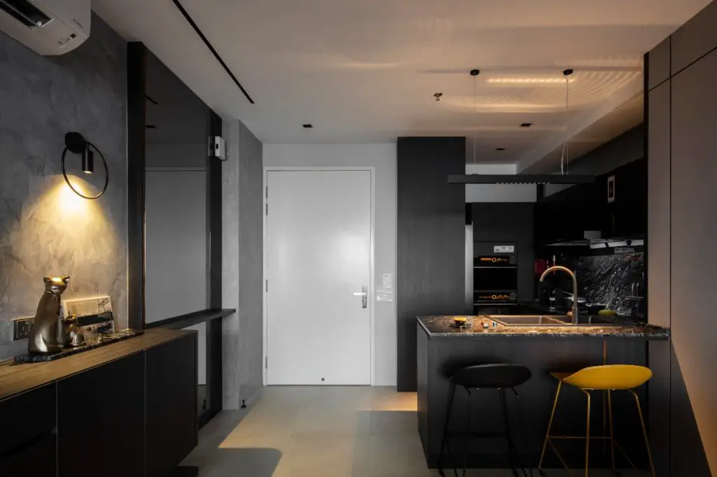
Upon entering the unit, you will be in the main area, which is an open concept combination of the living, dining, and kitchen.
Living and Dining Area
Key highlights:

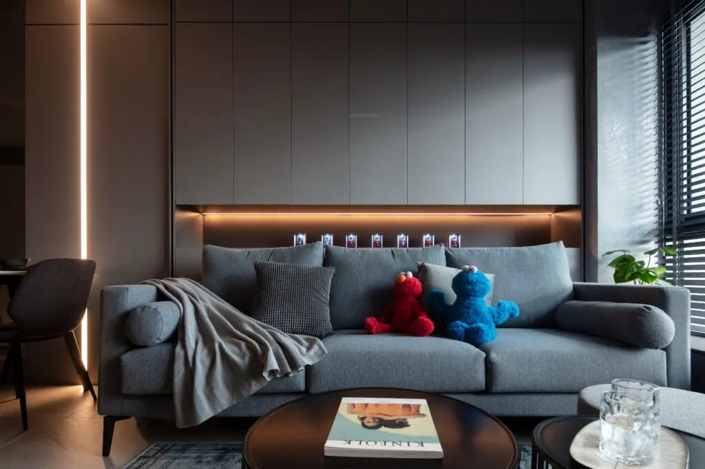
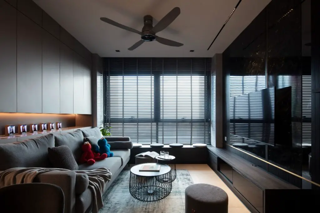
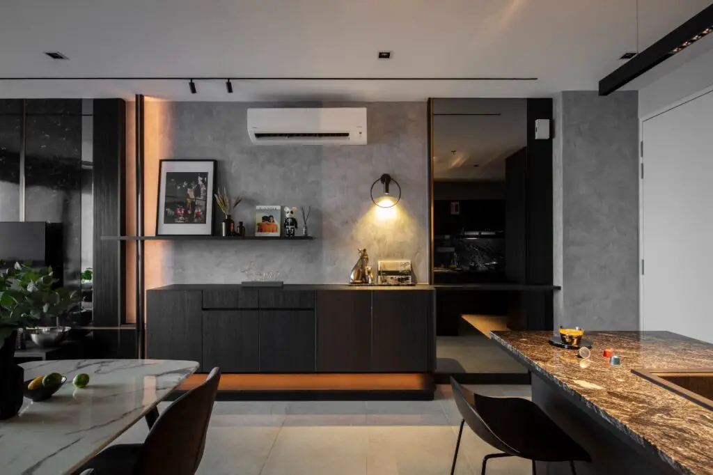
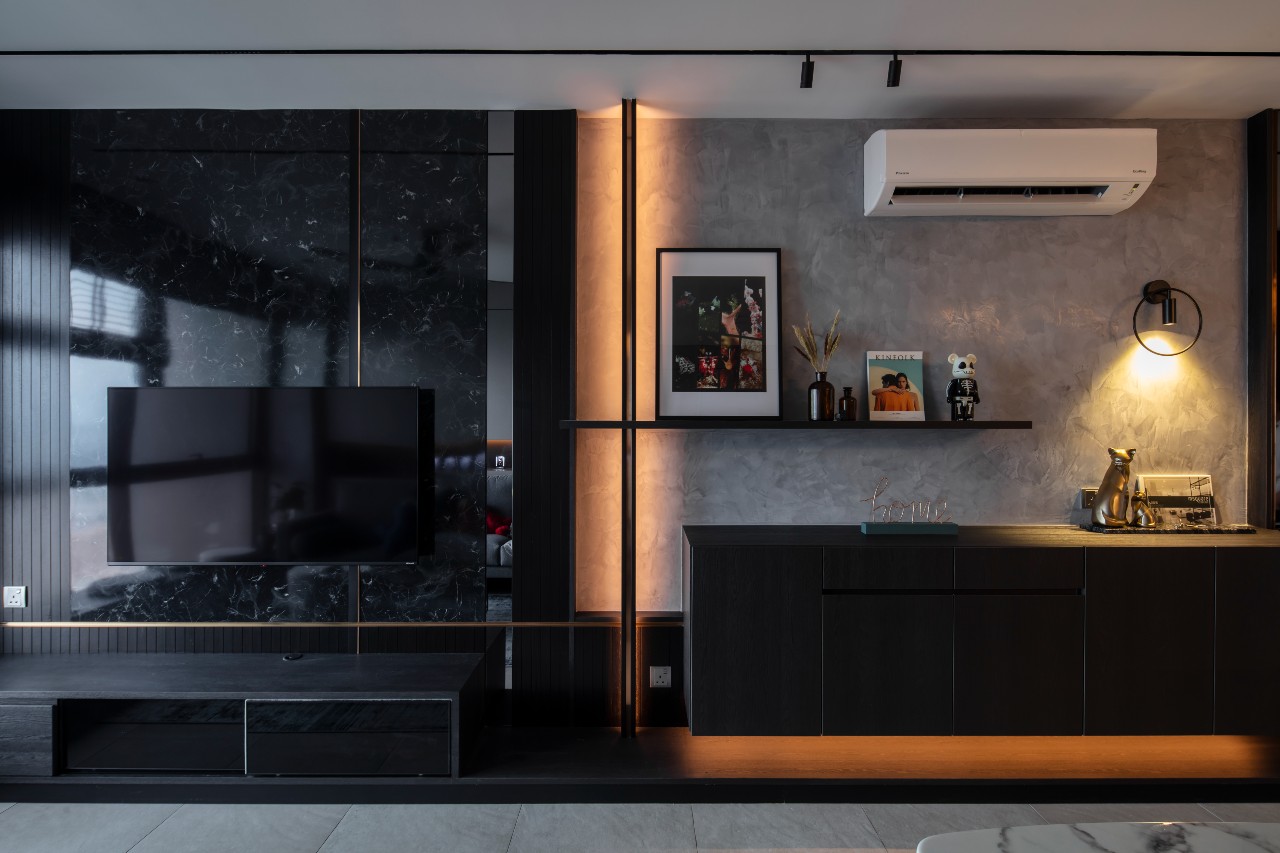
- Our main feature wall is a plastered Venetian wall. It holds a display shelf and a hanging console in dark forest oak carpentry. All of the metal works come with bronze detailing.
- As for the TV wall panel, we had the dark forest oak carpentry extend all the way from the console and display shelf to the TV console and built-in bench by the window to maintain continuity.
- The main highlight of the TV area is the full-height wall panel in black marble design combined with nyatoh timber strips and bronze trimmings.
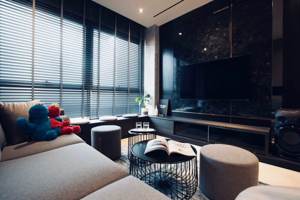
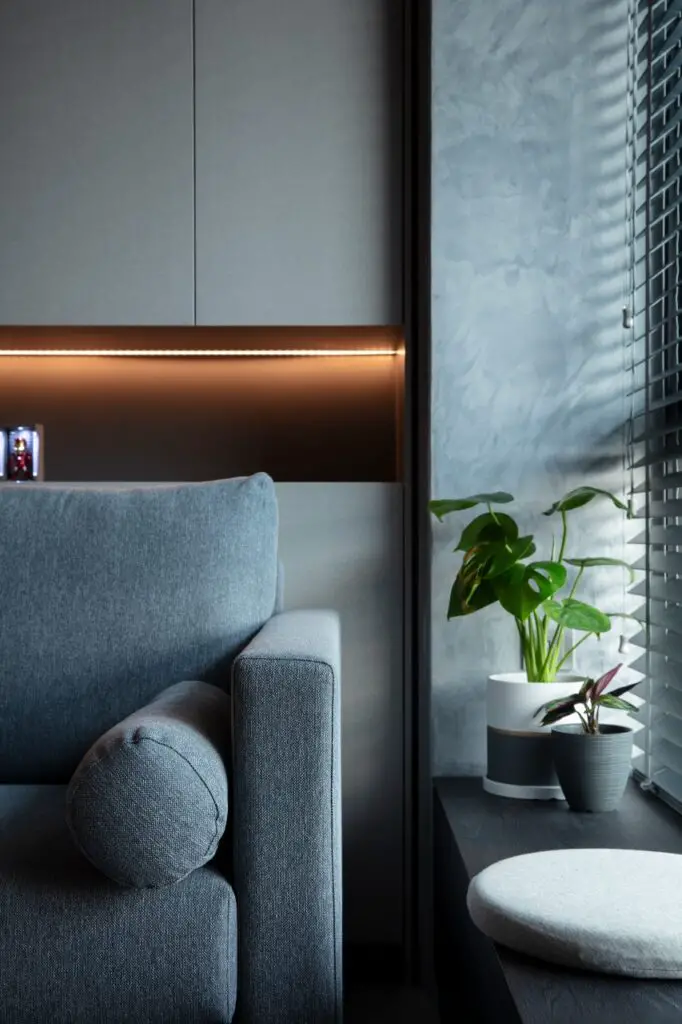
- We also added a built-in bench by the window, which is good for reading and having my morning coffees. There is also additional storage underneath.
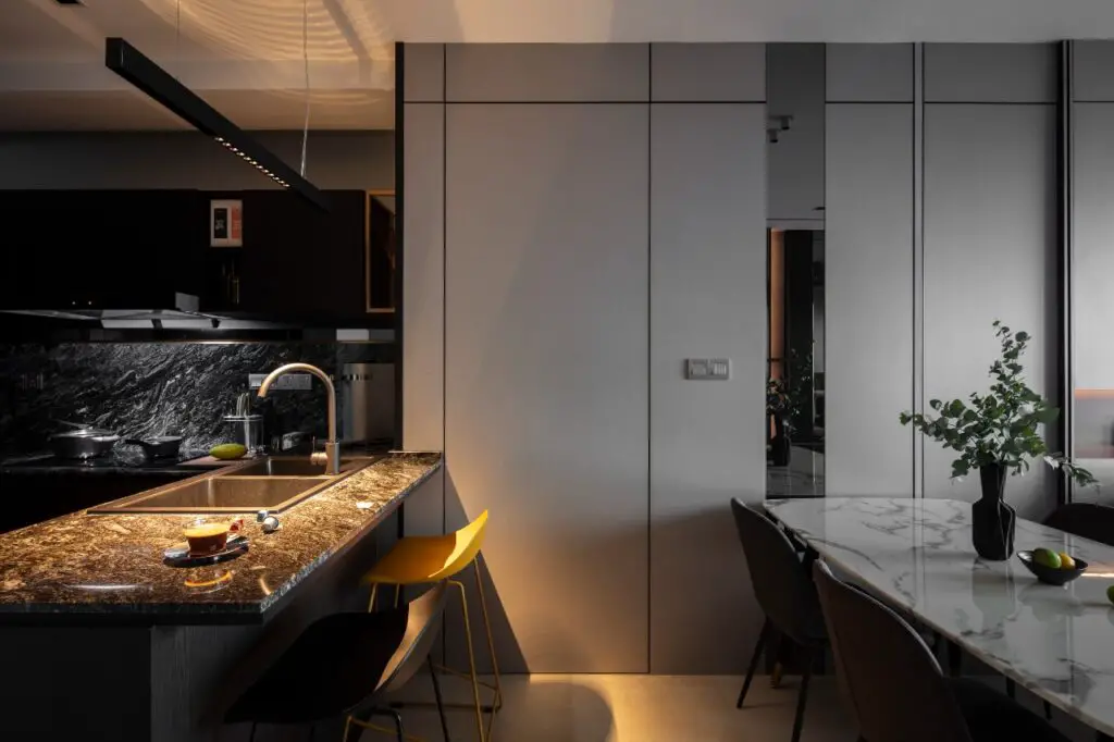

- Finally, we have additional wall storage behind the sofa. The built-in wall cabinets extend to the wall panel in the dining area. It also comes with a hidden door. I cook quite a lot, and I didn’t want the smell to get into the rooms. Therefore, the idea to have a hidden door to the rooms is quite brilliant. The wall cabinets come in a light grey fabric laminate finishing.
Kitchen
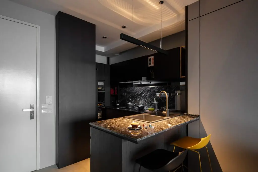
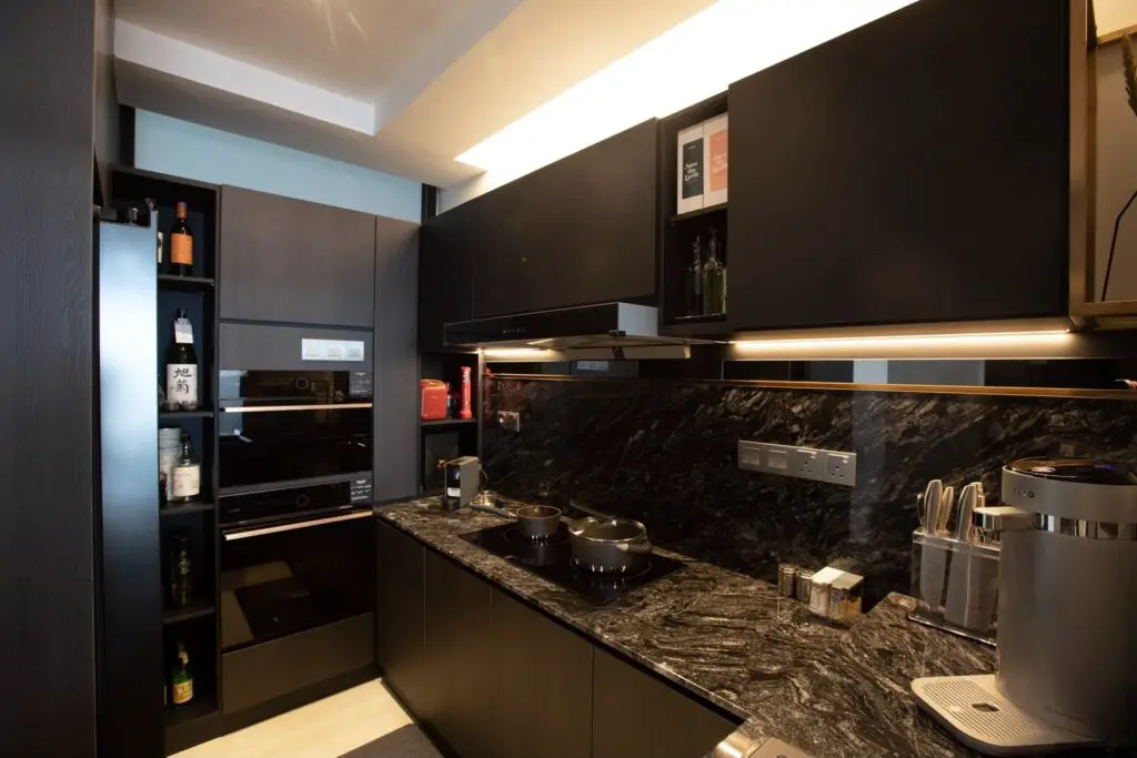
We used black granite for our countertops and backsplash. I love how the veins remind me of waves hitting the shore. The cabinets also have a dark forest oak finish like the living area. We incorporated grey mirror detailing in each of the areas, which is a nice finishing touch.
Home office
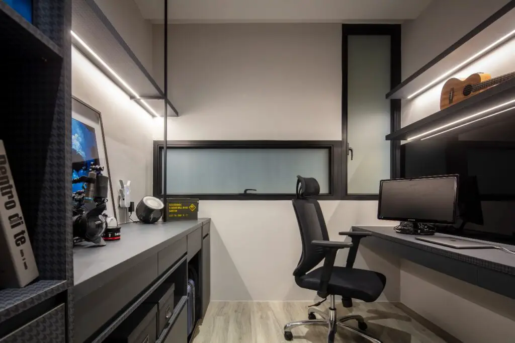
Our home office will be on the left once you enter the hidden door. The theme/concept for this room is slightly different from the main areas. However, the color theme still falls on the darker spectrum.
Key highlights:
- Dark Chidori pattern laminated cabinets
- Display shelves
- Black glass panel for notetaking, doodling, etc.
Powder/Laundry room
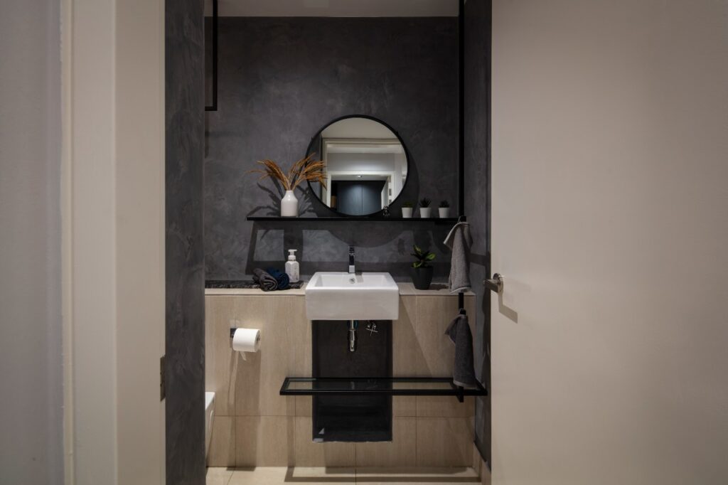
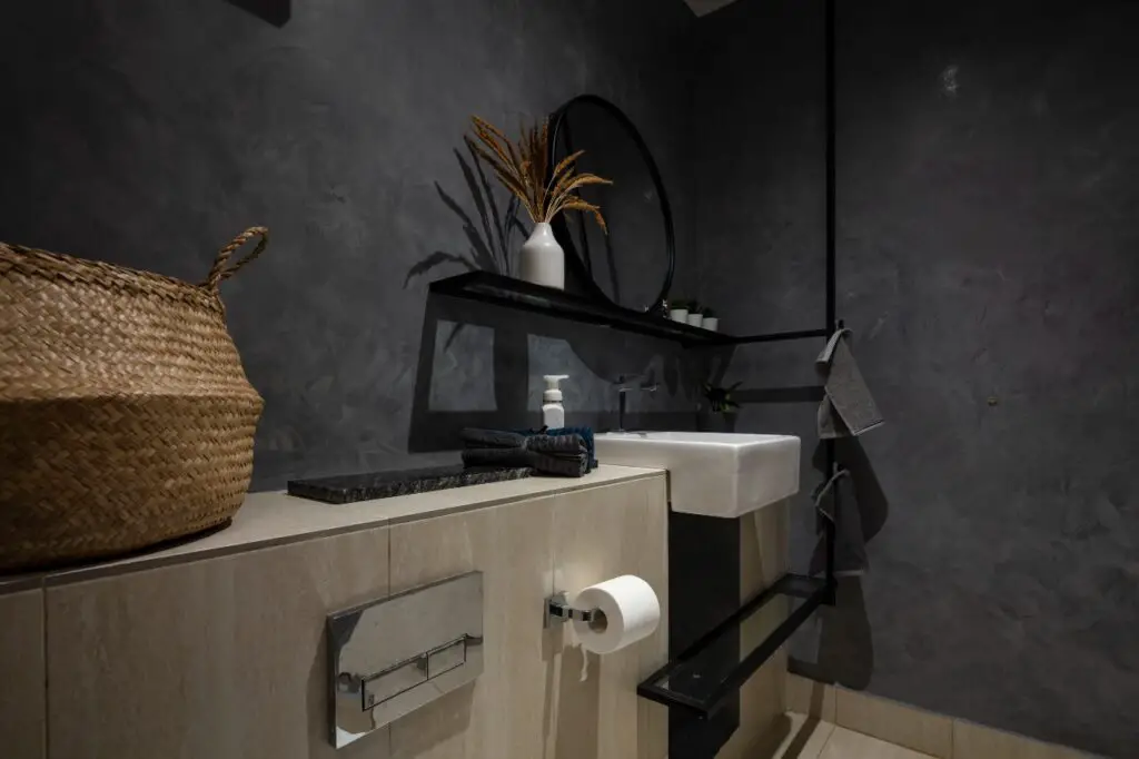
We used the same Venetian plastered walls for this room.
Master bedroom
Our master bedroom and bathroom are at the end of the corridor.
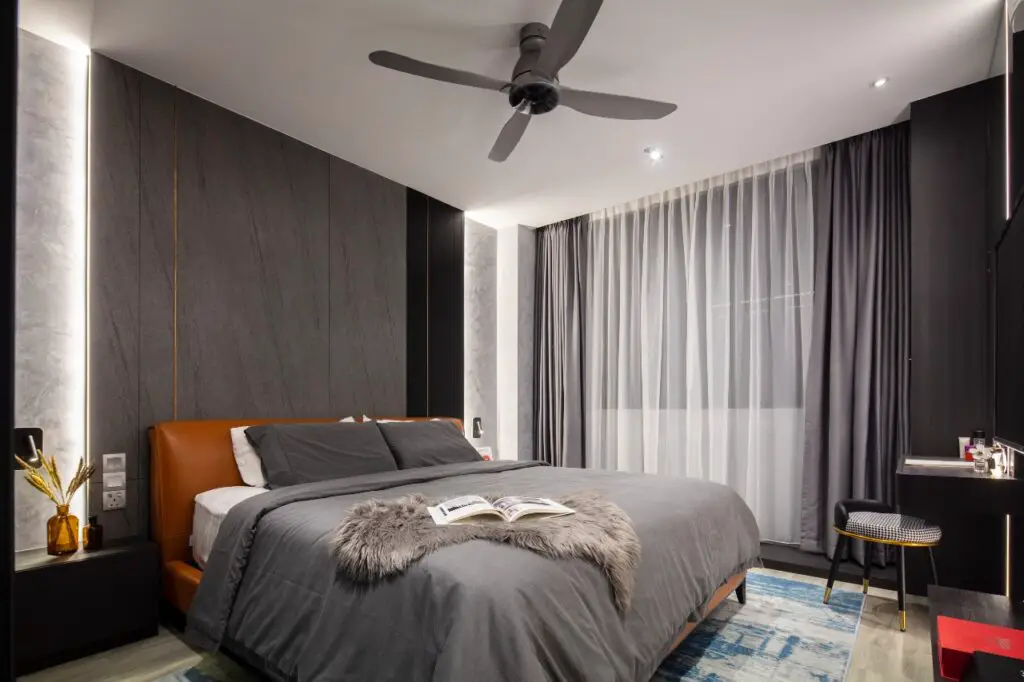
Key highlights:
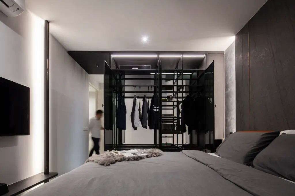
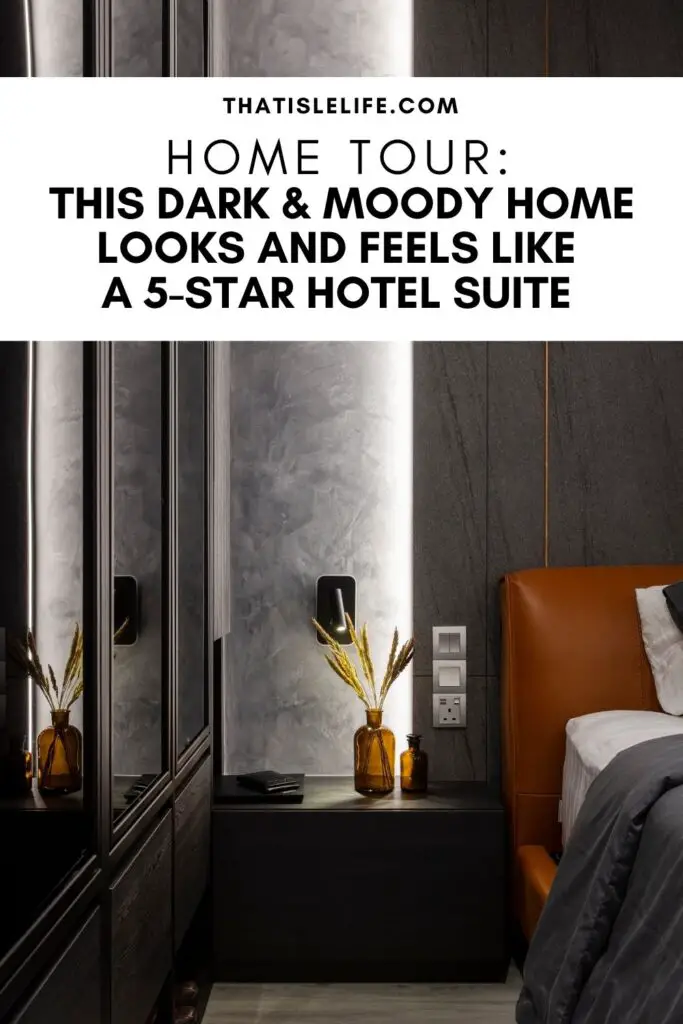
- Our “floating” glass wardrobe is something you don’t see very often in homes. We wanted it to look like a boutique-style wardrobe. It is fully covered in dark tinted glass and supported by metal frames bolted from the ceiling to the floor. It also has a row of dark forest oak drawers along both sides of the wardrobe. The entire combination creates the illusion that it is “floating”. This wardrobe serves as a display cabinet for fine clothing, accessories, and shoes (at the bottom platform).
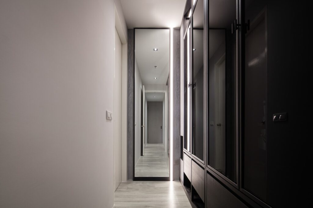
- There is also a full-height mirror on the other side of the wardrobe, with front facing LED strips to help with illumination.

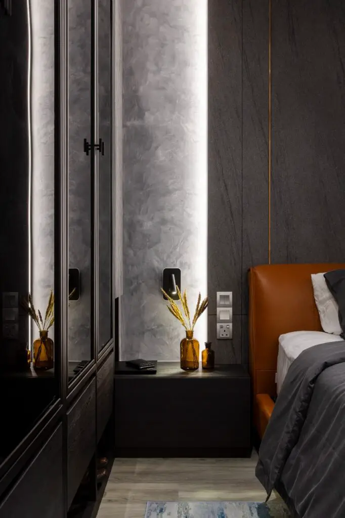
- We wanted to maintain the continuity of the theme throughout the bedroom. So, we used the same dark forest oak finishing for the bed side table, which is connected to the wardrobe. It extends all the way to the bed head and the dressing table.
- The full-height bed head panel consists of a laminate that looked and felt like natural stone. We complemented it with bronze trimmings and nyatoh timber strips finishing on the side before placing it on the Venetian plastered wall.
- To add color into the bedroom, we selected a tan coloured leather bed frame as the main furniture highlight of the master bedroom.
Master bathroom
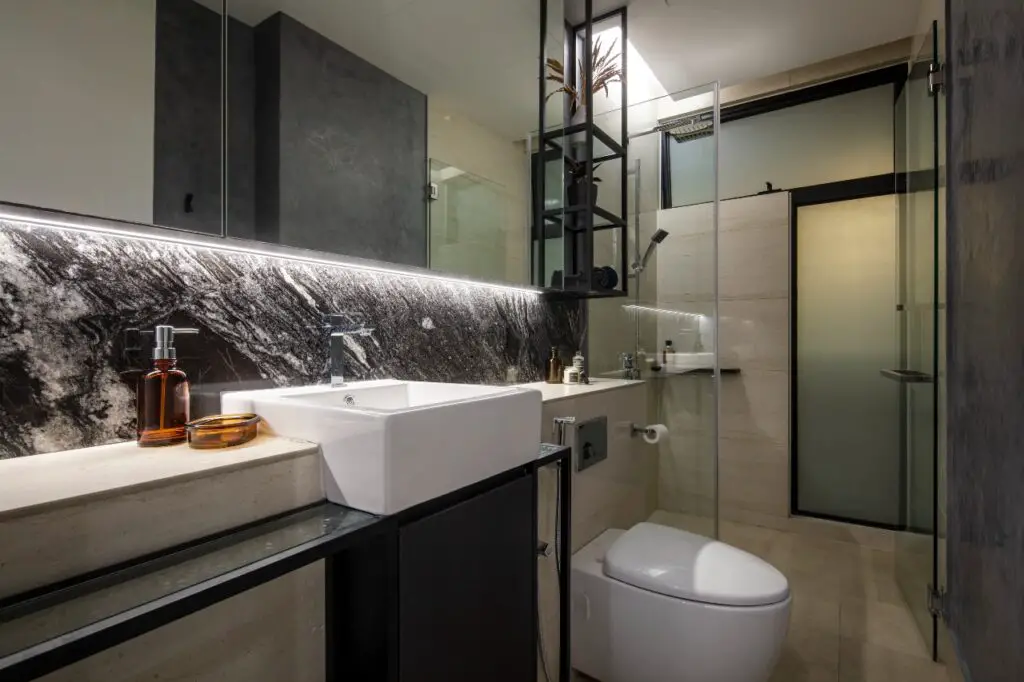
The master bathroom boasts a full-length mirror with a storage cabinet across the drywall area.
We used the same granite stone as a backsplash for the master bathroom’s vanity and the same dark forest oak finishing for the cabinets to stay consistent with the theme. There are some metal racks for display/open storage as well.
Lighting
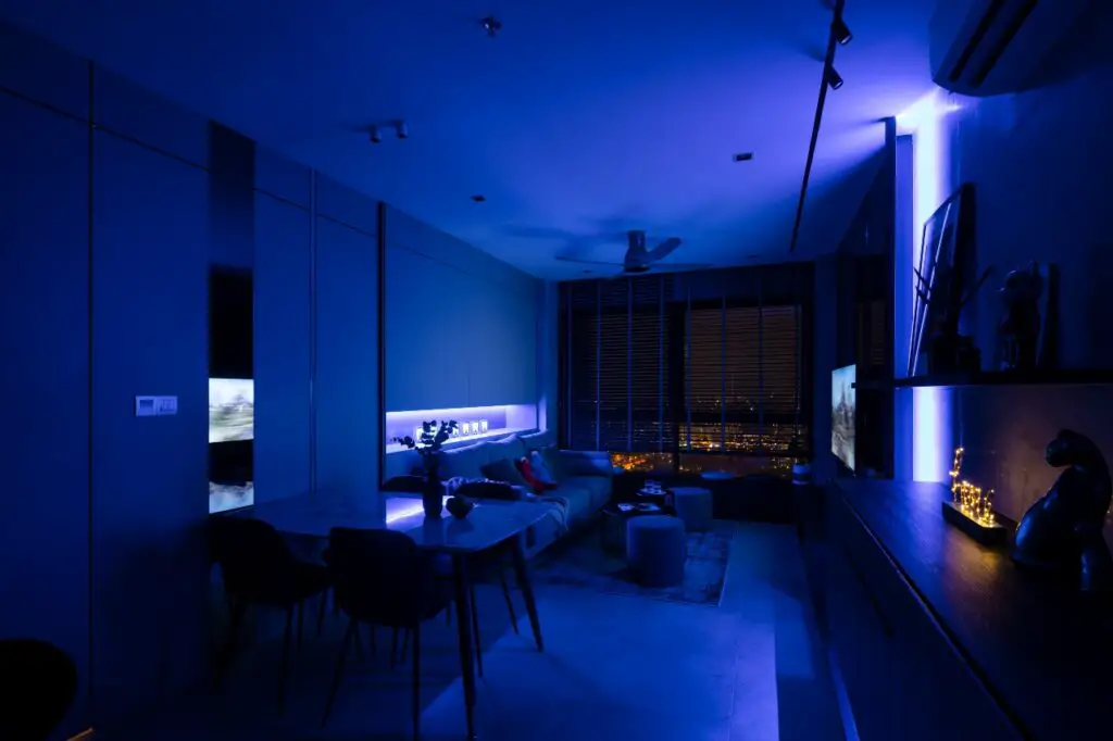
My ID joked that my home is a light museum because of the amount and various types of lights installed in my home (respective to the size).
In addition to the basic existing lighting that comes with the home, I have LED light strips in every room, a track light system, and a couple of spotlights in the living room.
I think lighting is one of the most important things that most owners tend to overlook (or find less important) when doing a home makeover.
Lighting serves more purpose than just brightening up the home. With the right type and amount of lighting, it can transform the home into something else. Lighting highlights the important features and hides the least striking ones, creating the perfect mood and ambiance for the home.
Accent color
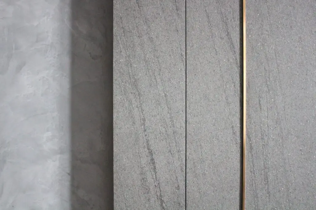
Besides that, we decided on bronze as an accent color. Since the overall theme is dark, we needed to have a bold color to avoid everything from looking flat.
We chose bronze over gold because gold would have stood out too much. Bronze was the perfect color to create subtle detailing to the overall dark carpentry theme.
On top of the bronze detailing, we added grey mirrors and nyatoh timber strips detailing.
What inspired your home decor?
The inspiration comes from various sources like places that I’ve visited, hotel rooms I’ve stayed in, and photos/videos I’ve seen on the Internet/Pinterest.
But, what really drove the inspiration for the overall concept is the continuity that I wanted to achieve from the moment one enters the condo building. I wanted the design to flow from the exterior/facade of the building, through the corridors, and into my unit. I didn’t want a feeling of disconnect when stepping into my home from the main building.
Since the concept of the condo building is pretty industrial, we adopted the same industrial feel as well.
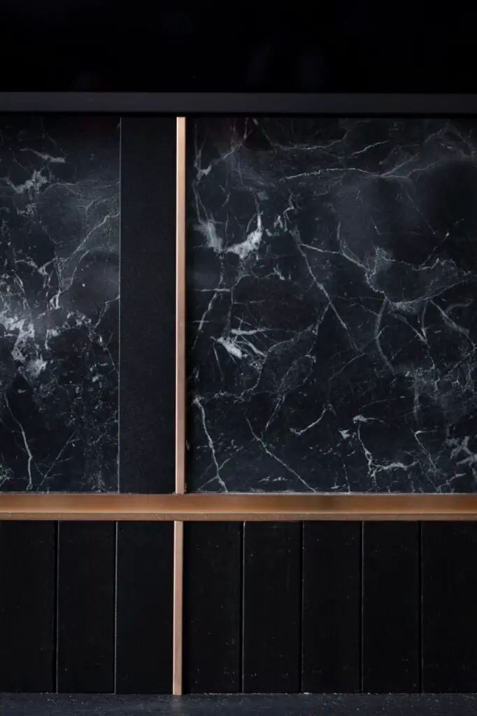

To achieve the industrial yet luxurious feel, three main elements were selected for the home – metal, wood, and glass/mirrors. All of these details are noticeable throughout the home.
While the elements above are quite common in most homes, the color selection makes it different. I prefer a darker theme, as it brings out the little details in the design.
I also did not want to have any white walls and no wallpaper, as I prefer to have a
“real” feel and touch for the elements in the home.
The continuity theme doesn’t just flow from the exterior to our unit. Our interior has the same continuous theme from room to room. The same colors and materials are adopted in almost all of the areas. As a result, the condo doesn’t have much of a “rojak” look and feel.
What do you think makes your home you?
Personally, I’ve always tried to be unique and be different. The home design reflects this sentiment as well, with the bold and #daretobedifferent concept.
Did you hire an interior designer for your home?


Yes, I got help from an ID (Msquare Creation) because managing a home renovation on your own is really difficult. To achieve the results/outcome you want requires a lot of attention to detail, which is challenging for me in terms of time and energy. Therefore, it was worth it.
I was also pretty lucky to get an ID who truly understood the sort of concept, theme, and overall look and feel that I was looking for.
The whole renovation process took about 3 months (including the MCO period) from start to finish.
What is your favorite element in your home?
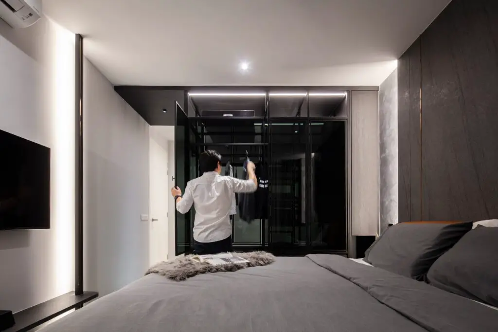
Too many to choose from. For the living area, I would pick the main feature wall that runs all the way to the tv area. As for the bedroom, it’s most probably the “floating” wardrobe.
I like them because they are a one-of-a-kind design. You don’t really see them anywhere else, and I would say they are the unique signature pieces of the home.
What is the best investment you made for your home?
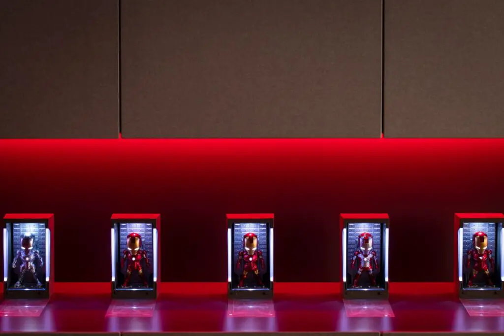
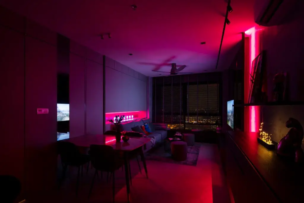
Lights! I spent almost RM4,000 on a smart track light system and LED light strips for the whole unit. They are perfect for lazy people like me, as they are controllable via my
phone through an app.
The best part about it is that I can create any sort of ambient/mood lighting I want in my living area. There are a million color combinations available for me to play around with whether it’s a movie night, poker night, gathering with friends/family, dinner time, and many more.
Name one regret you have about your home.
So far no regrets. But, if I could change one thing, it would be the window area in the master
bedroom. Currently, it is only a half-height window. It would be great to change it to a full-height window just like the one in the living area. Then, I would be able to have an uninterrupted view of the whole neighborhood.
Where do you shop for furniture and home decor?
Living
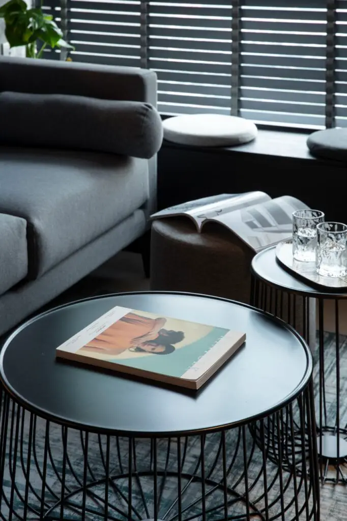
- JoyDesign Studio (Damansara Utama) – sofa, coffee tables
- Taobao – stools, cushion seats, decors
Kitchen
- Builder’s Hardware (Kepong) – Fotile appliances (oven, steamer, hood &
hob) and granite sink & tap - Marble Emporium (Subang) – granite countertop/backsplash
Bedroom
- Rozel (TTDI) – bedframe, mattress
- Akemi (1 Utama) – bedsheets, duvet, etc
Others
Any advice you would like to share with others?
Budget
You don’t need a million dollars to make your home look like one. It’s about having the
right theme, concept, and elements. These will make any home look great.
Having said that, it would be good to have a nice budget put aside for home renovation. Bear in mind that the bigger your home is, the more space you would need to cover (in terms of renovation), and therefore a higher renovation budget is required.
That’s why you need to start thinking of the renovation budget when you purchase your property. The renovation budget is approximately about 10-20% additional of the property price.
Consistency
Another important thing is to have a consistent theme across the whole home, so it doesn’t look too “rojak”. This is a struggle for most homeowners because some couples have
conflicting ideas (or too many ideas), and we would love to have everything.
However, we need to learn to let go of some of the ideas if they do not fit well into the overall theme/concept.
Details
Details are also important. This is another aspect where most homeowners tend to overlook. While they prefer to spend most of their budget on furniture to make their home look great, imagine putting nice rims on a “kancil”. Rims would definitely look cool, but if you step back a little and look at the overall car, something’s a bit off, ain’t it?
Therefore, the biggest challenge is to balance the budget you have. I recommend spending it on details like lighting, mirrors, and details like groove lines to bring out the best parts of your home, and then complementing these details with furniture.
There are many good-looking furniture sold by local makers such as Joy Design,
Kinsen and MoreDesign. Find the ones that bring comfort without breaking the bank. If
budget is something you are really tight with, take time to replenish and furnish your home later. Some “nice-to-have” furniture can wait.
Interior designer
If you are engaging an ID, find one that you can work well with. If possible, have a look at
their previous works or projects and visit them to check the workmanship of their contractors.
While it’s nice to find the cheapest ones, oftentimes it also means cheaper material, and less
attention to detail in terms of design and consultation. Again, it’s all about balance. Find a good one that fits your budget and ideas and doesn’t cut costs on material usage.
Most importantly, trust them and try not to change their design or concept too much. You hire them to provide ideas and what is best for your home. They are not products you can compare prices with and pick the cheapest ones out of the lot.
Interior designers provide service in the form of creativity and ideas, so it’s not fair to compare them like you would with a product.
What do you love most about KB’s dark and moody condo? Follow his journey on Instagram and Facebook.
One of my favourite home tours so far- thanks for featuring it!
You’re welcome! I love it too. So different than mine, but I can appreciate all the little details!
What a cool looking space!
Thank you! It’s so sleek.