It’s time for another round of Then and Now, this time featuring our master bedroom. In case you missed it, I started a ‘Then and Now’ series on the blog. Why this series?
We’re making it a point to document the present since we are going to make some changes to the apartment. That way, we can look back and see how far we’ve come!
Last month, I wrote all about our living room. In this post, I’m going to share what our master bedroom looked like before and now. Spoiler alert – this is the only room I liked before better than now.
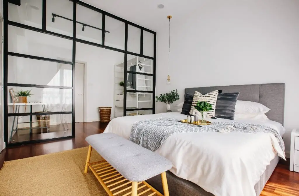
Master bedroom – Then
Let’s talk about the design process first. As much as I love interiors, my husband is equally as fussy about what he likes and doesn’t like.
He insisted we kept the bedroom minimal yet functional. In other words, he didn’t want it “over-designed” because he wanted our bedroom to feel like a sanctuary.
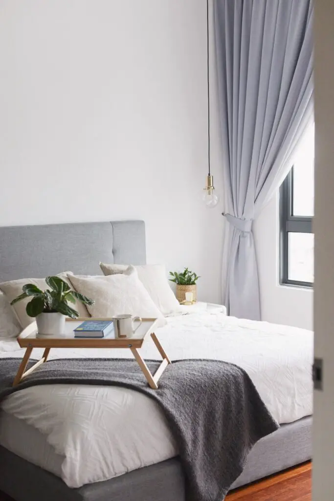
With that, we chose grey as the primary color of our bedroom. It’s such a soothing color, and it’s great at hiding most stains or blemishes. So, we bought an upholstered grey king-sized bed frame and matching curtains for the room.
Then, we settled on white melamine nightstand tables because they were on sale. We custom-made our beds with a local furniture company who wanted to get rid of the nightstand tables. So, we grabbed both tables for $25! What a steal!
As for the hanging pendant bedside lights, I spotted them in my designers’ portfolio and instantly fell in love. Not only do they save space, but they remind me of a posh hotel. If you know me, you’d know that staying in hotels is my guilty pleasure!
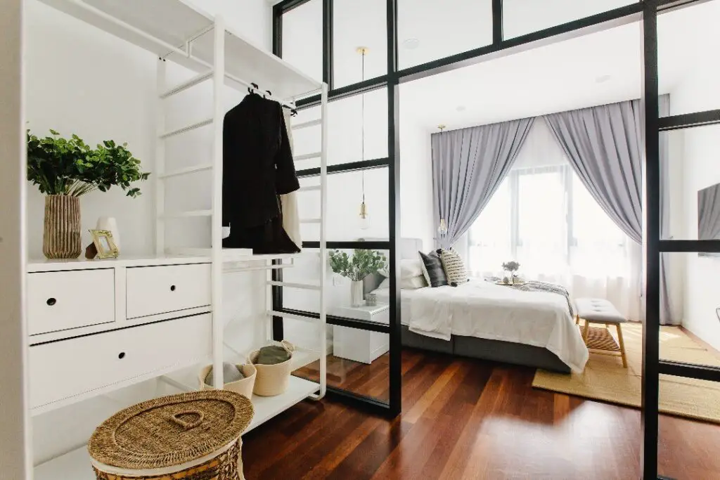
I also fell in love with the crittall divider that we installed to separate the main sleeping area and our wardrobe. It is hands-down one of the best decisions we made during renovations.
Our designers had suggested a built-in wardrobe for this area, but we’d already gone above the budget, and the built-ins were too expensive. We had no choice but to get our wardrobe from good ol’ Ikea.
Back then, I told my husband we should install a bigger wardrobe in the guest room where we could store clothes we don’t wear as often. Then, we would only have our everyday clothes in our open wardrobe, and the room wouldn’t look cluttered.
Well, let’s just say, I completely regret my decision, and our bedroom is far from clutter-free! But, don’t be fooled by these before pictures, they were taken before we moved in all of our stuff.
In terms of the styling, our interior designers did a fantastic job. We loved all of the colors, patterns, and textures they used to create a warm and cozy bedroom.
We especially LOVED the jute rug they placed in front of the bed. Unfortunately, we couldn’t keep the rug because of our dog. We were so sad when they took it back!
Before master bedroom photos were taken by Groundwork Studio.
Master bedroom – Now
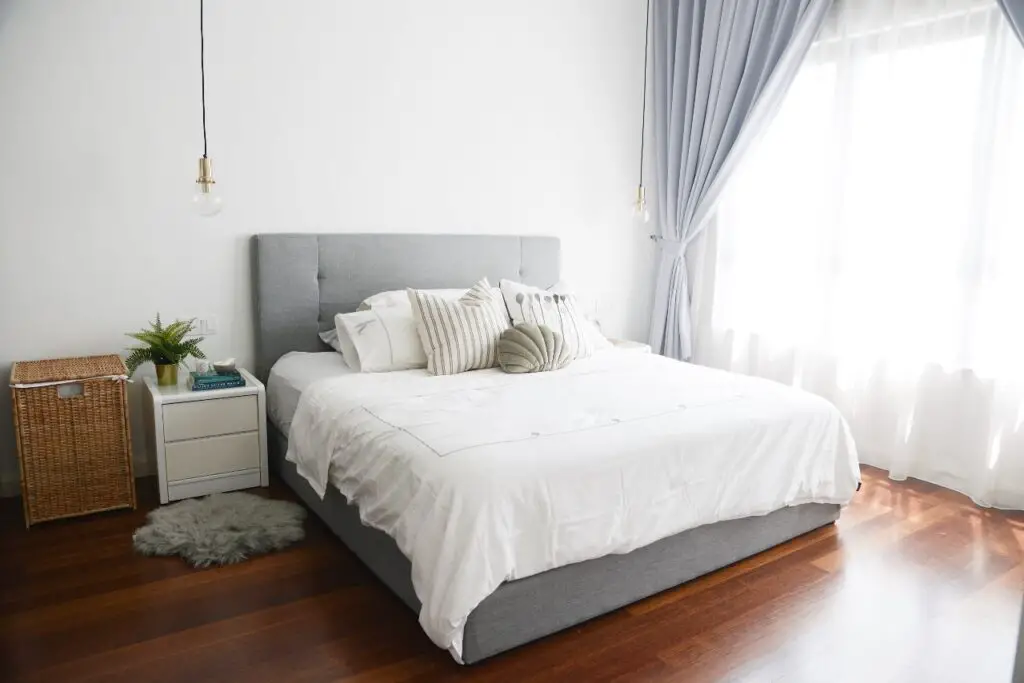
Frankly, we haven’t done much to the bedroom, and I think that’s why I preferred the before.
We removed most of the decorative pieces like the tray and plants because they didn’t feel very practical. For instance, I’m constantly knocking over things on my nightstand in the morning when I’m searching for my glasses.
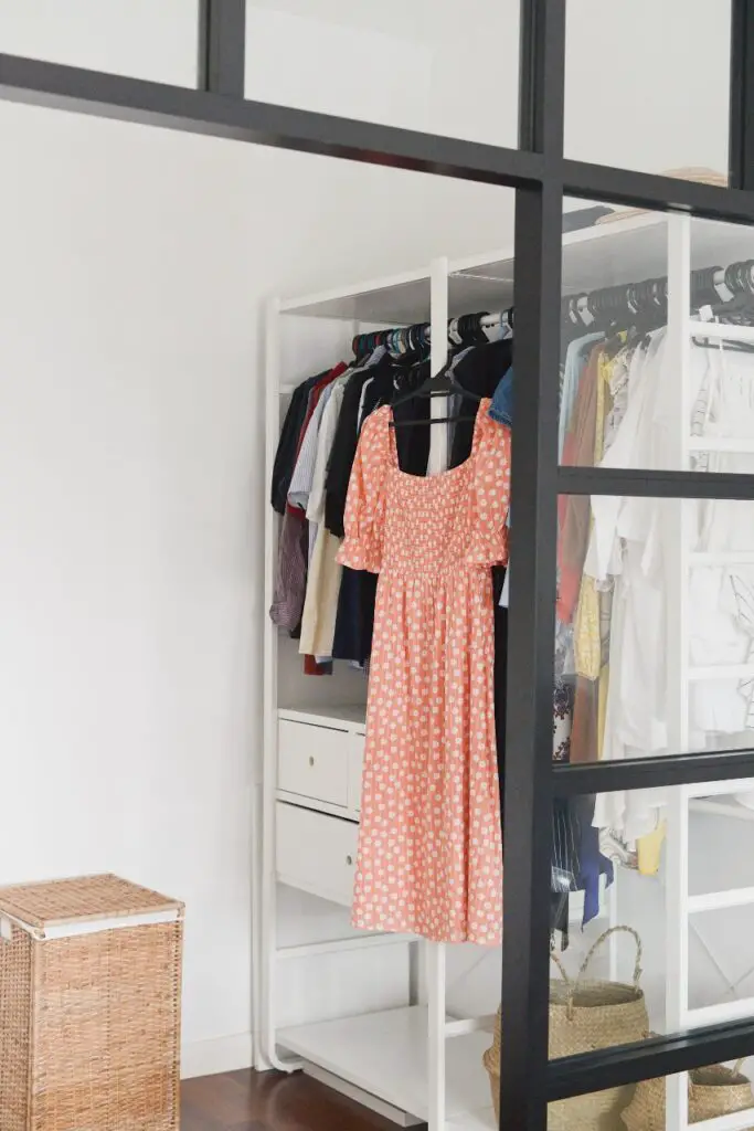
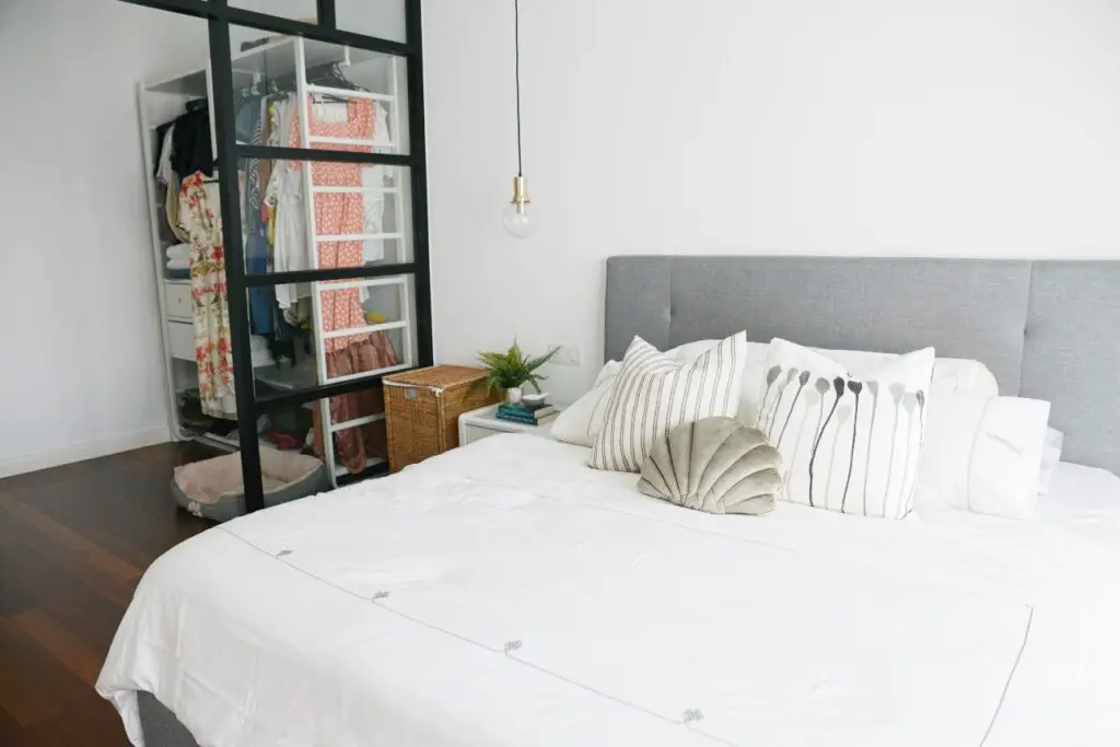
Besides that, my “brilliant” wardrobe plan has caused me the biggest headache. I completely underestimated the number of clothes I have, and there’s barely any space to accommodate all of them now.
I don’t know why this never crossed my mind back then, but it’s so inconvenient to get dressed when half of your clothes are in the guest bedroom.
All of my go-to outfits are currently on the bottom shelf, and they make the bedroom look so messy.
To make things worse, I used the Ikea table opposite the wardrobe as storage instead of a proper vanity table.
I’d decided on an Ikea table with slim legs at that time because we’d already spent so much money on renovations. I figured I’d turn it into a beautiful and functional vanity area over time.
Well, three years have passed, and I have done absolutely nothing to it except put all of my junk on it. I didn’t even purchase a mirror!
At this point, I just feel like our bedroom is so cluttered and lacks personality…
Master bedroom – What’s next?
First, I have to get organized and get rid of all of the clutter. I’m thinking of selling the vanity table and replacing it with a dresser. I’ll also like to add hooks and baskets to increase storage space for my clothes and accessories.
Once everything is in place, it’s time to style!
Since we have some room next to our TV, I plan to add an armchair and a small wall shelf to create a reading nook. This area gets so much natural light because it’s next to the window. It’s about time we capitalize on such a beautiful space! I can already picture this nook to be a great place to laze in other than the bed.
I also want to change our nightstands. These have served us well, but they’re a little small. A bigger nightstand would be great so I can add decorative accents without knocking them over.
Last but certainly not least, I’m thinking of doing something to the wall behind the bed. I’m so indecisive, and I’ve been flip-flopping with my decision.
On some days, I’d like to DIY a board and batten. On other days, I want to slap on a piece of statement wallpaper. Recently, I’ve been toying with the idea of installing beadboard instead.
I can’t seem to make up my mind!!! Does anyone else face the same issue?
I do, however, know that I definitely want to add more color to the bedroom. Our current grey, black, and white combo is making the room look a little sterile. I still want to keep things looking minimal, so I’ll most likely add neutral tones like brown and green.
It looks like I have to go back to the drawing board and create a vision board for my master bedroom. Hopefully, we’ll be able to re-design the master bedroom without compromising style or function!

